Making the Invisible Visible
Making the Invisible Visible
Designing the RGB Wonder Wheel for Children's Museum of Atlanta
Designing the RGB Wonder Wheel for Children's Museum of Atlanta
Team
Annette Guan
Jane Huang
Timeline
Feb 2024 - May 2024
(4 months)
Methodology
Iterative testing, Physical Prototyping
Role
Designer, Fabricator & Researcher
Led concept development and design direction. Modeled the viewing box in SolidWorks and built components through laser cutting. Co-designed animated habitat visuals and led onsite playtesting.
Team
Annette Guan
Jane Huang
Timeline
Feb 24 - May 24
(4 months)
Methodology
Iterative Testing, Physical Prortotyping
Role
Designer, Fabricator & Researcher
Led concept development and design direction. Modeled the viewing box in SolidWorks and built components through laser cutting. Co-designed animated habitat visuals and led onsite playtesting.

At a Glance
At a Glance
How do you make the invisible visible?
How do you make the invisible visible?
Traditional color education is passive: watching demonstrations, looking at color wheels, mixing paint. But for children ages 3-8, abstract concepts need physical manifestation.
So, we designed the RGB Wonder Wheel for the Children's Museum of Atlanta to transform abstract concepts into tangible discovery. Using colored filters, animated animals, and an "odd one out" game, children manipulate red, green, and blue light to reveal hidden layers in images. Through play, they build intuitive understanding of how colors combine and interact.
Design Goals
Design Goals
01
01
Make color theory tangible for young learners through interactive exploration
Make color theory tangible for young learners through interactive exploration
02
02
Foster collaboration between children through shared physical interaction
Foster collaboration between children through shared physical interaction
03
03
Enable self-directed discovery without constant adult supervision
Enable self-directed discovery without constant adult supervision
04
04
Withstand high-energy use while remaining replayable
Withstand high-energy use while remaining replayable
Preliminary Research
Preliminary Research
Finding inspiration in Layered Visuals
Finding inspiration in Layered Visuals
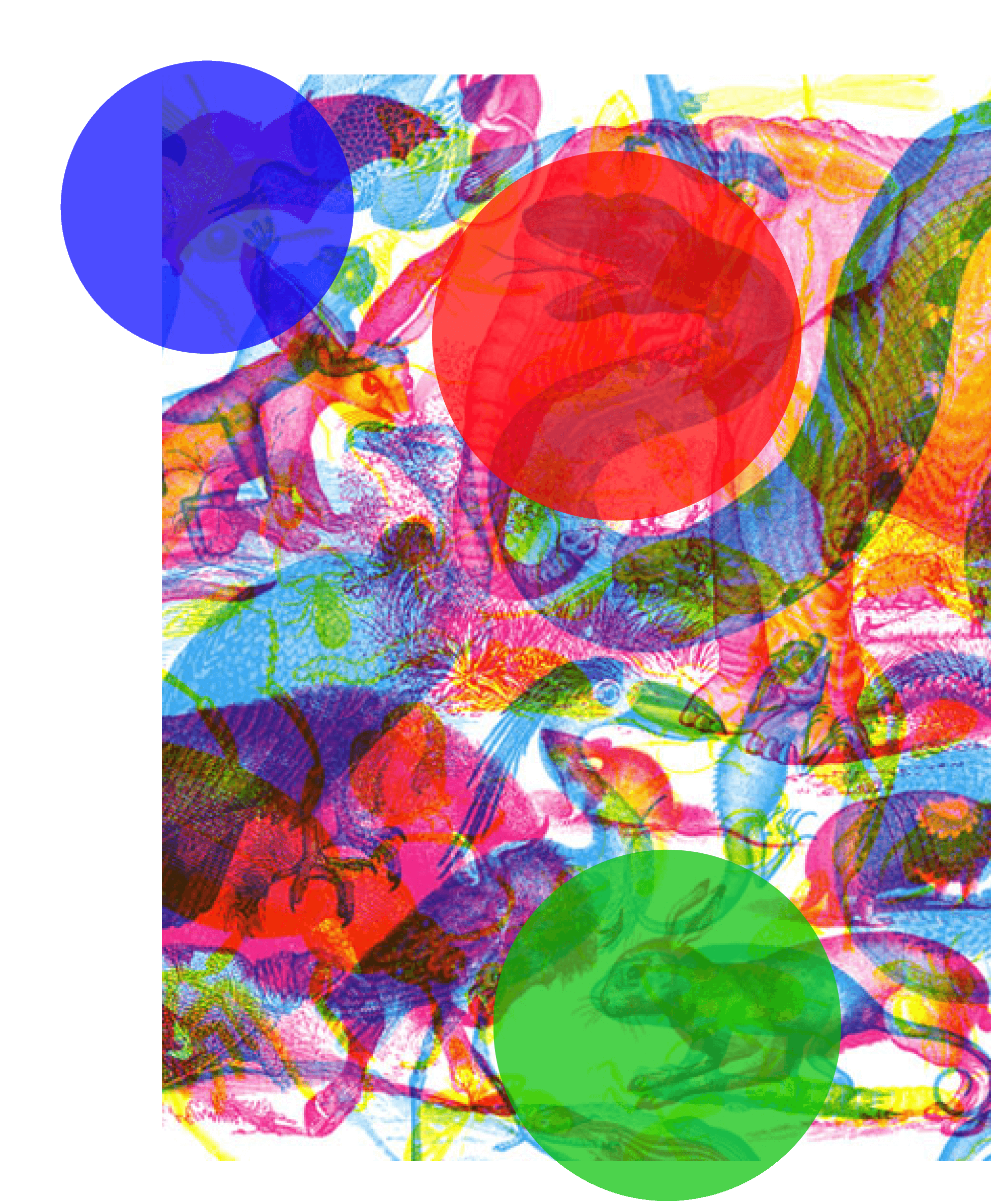
We drew inspiration from Milan-based artists Carnovsky, whose RGB series uses layered CMY (cyan, magenta, yellow) prints that transform under different colored lighting. When viewed through red, green, or blue filters, different visual layers become visible, demonstrating both additive and subtractive color principles.
We drew inspiration from Milan-based artists Carnovsky, whose RGB series uses layered CMY (cyan, magenta, yellow) prints that transform under different colored lighting. When viewed through red, green, or blue filters, different visual layers become visible, demonstrating both additive and subtractive color principles.
Our Divergence
Our Divergence
While Carnovsky created large-scale installations, we needed:
While Carnovsky created large-scale installations, we needed:
Compact form factor for limited museum space
Animation to boost engagement and replayability
Game mechanics to create structure and goals
Multi-user design to encourage collaboration
Compact form factor for limited museum space
Animation to boost engagement and replayability
Game mechanics to create structure and goals
Multi-user design to encourage collaboration
Design Consideration
Design Consideration
Architecture and Mechanics
Architecture and Mechanics
Much like Pandora's irresistible urge to peek inside the forbidden box, this installation was designed to spark curiosity and encourage self-directed exploration. To understand how form and interaction complexity impact engagement, I explored two interaction concepts.
Much like Pandora's irresistible urge to peek inside the forbidden box, this installation was designed to spark curiosity and encourage self-directed exploration. To understand how form and interaction complexity impact engagement, I explored two interaction concepts.
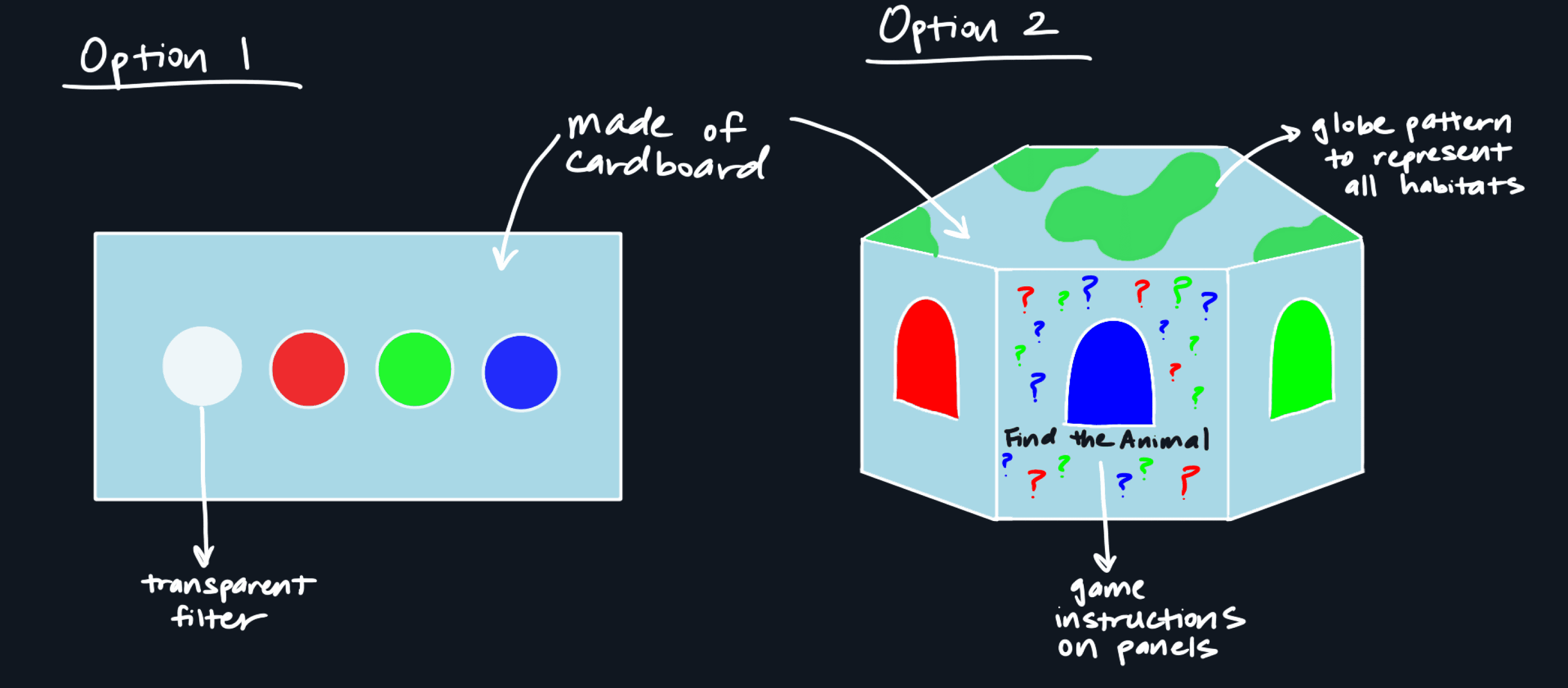
While Option 1 (flat, cardboard surface) supported basic learning goals, Option 2 (triptych puzzle box) with its physicality and mystery delivered a more immersive and replayable experience, making it the stronger choice for a museum context.
While Option 1 (flat, cardboard surface) supported basic learning goals, Option 2 (triptych puzzle box) with its physicality and mystery delivered a more immersive and replayable experience, making it the stronger choice for a museum context.
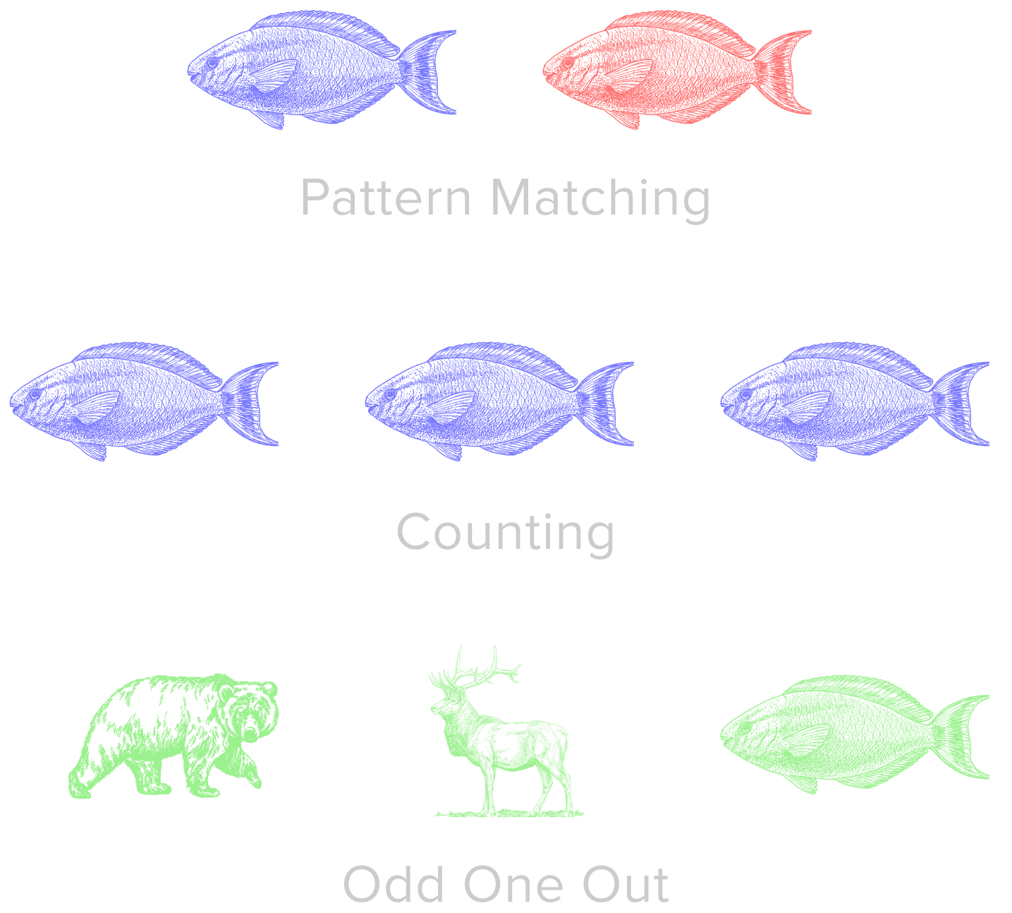
Initial Game Ideas
Initial Game Ideas
✗
✗
Less visually compelling than Carnovsky-inspired interactions
Less visually compelling than Carnovsky-inspired interactions
✗
✗
Risk of limited engagement for older children
Risk of limited engagement for older children
✔
✔
Offers a more visually striking and engaging challenge, better suited for sustained play
Offers a more visually striking and engaging challenge, better suited for sustained play
Design Process
Design Process
Three iterations, continuous learning
Three iterations, continuous learning
The workshops made it clear that simply digitizing classroom tools wasn’t enough. We reimagined a hybrid concept: a game that blends playful agency with purposeful reading strategies.
The workshops made it clear that simply digitizing classroom tools wasn’t enough. We reimagined a hybrid concept: a game that blends playful agency with purposeful reading strategies.
Iteration 01 / Internal Testing
Iteration 01 / Internal Testing
Learning the basics of physical interaction
Learning the basics of physical interaction
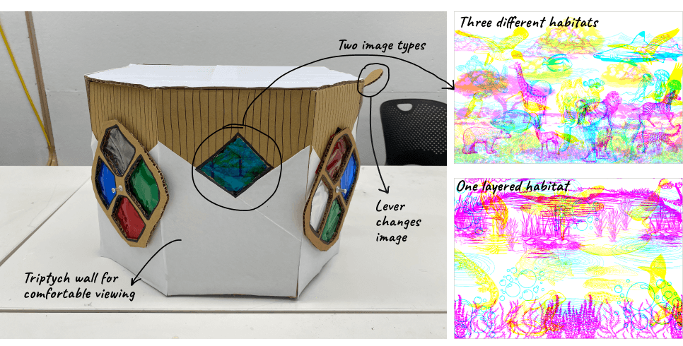
Our first prototype was a small cardboard viewing box with two color filter wheels and static layered images. We tested whether the filter mechanism was intuitive and which image layering style worked best.
Our first prototype was a small cardboard viewing box with two color filter wheels and static layered images. We tested whether the filter mechanism was intuitive and which image layering style worked best.
Key Findings
Key Findings
Too small: Single-user viewing box limited collaboration
Too small: Single-user viewing box limited collaboration
Unclear interaction: Lever mechanism didn't clearly indicate how to change images
Unclear interaction: Lever mechanism didn't clearly indicate how to change images
Durability issues: Pushpin attachment for wheels wasn't secure enough
Durability issues: Pushpin attachment for wheels wasn't secure enough
Static images: Didn't encourage replayability or sustained engagement
Static images: Didn't encourage replayability or sustained engagement
->
->
What we changed
What we changed
Upsized viewing box to accommodate two children simultaneously
Upsized viewing box to accommodate two children simultaneously
Replaced lever with button box for clearer feedback
Replaced lever with button box for clearer feedback
Reinforced filter wheel attachment mechanism
Reinforced filter wheel attachment mechanism
Added animation to animal habitats
Added animation to animal habitats
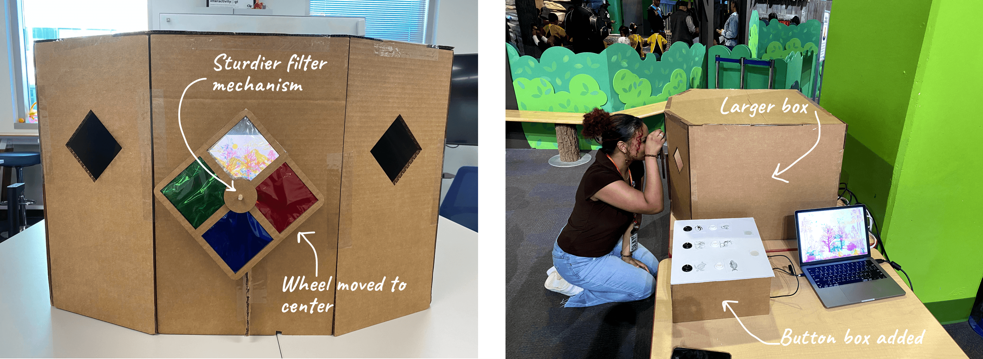
Iteration 02 / First Museum Test
Iteration 02 / First Museum Test
Testing with real children in the wild
Testing with real children in the wild
Expanded the viewing box, added animated habitats, and introduced a button box with LED feedback. Our first test with real museum visitors was a success, children eagerly spun wheels and pressed buttons, showing strong engagement.
Expanded the viewing box, added animated habitats, and introduced a button box with LED feedback. Our first test with real museum visitors was a success, children eagerly spun wheels and pressed buttons, showing strong engagement.

Key Findings
Key Findings
Button placement: Flat design and location made it hard to see and access
Button placement: Flat design and location made it hard to see and access
Single Wheel Bottleneck: Created waiting queues, limiting simultaneous play
Single Wheel Bottleneck: Created waiting queues, limiting simultaneous play
Complexity Overload: Younger children (3-5) struggled with the game concept
Complexity Overload: Younger children (3-5) struggled with the game concept
Instructions ignored: Both children & parents skipped reading the guidelines
Instructions ignored: Both children & parents skipped reading the guidelines
->
->
What we changed
What we changed
Redesigned button box with sloped top
and centered placement
Redesigned button box with sloped top and centered placement
Added second wheel to enable
collaborative play
Added second wheel to enable
collaborative play
Simplified game by reducing habitat complexity
Simplified game by reducing habitat complexity
Created clearer, more concise instructions with visual cues
Created clearer, more concise instructions with visual cues
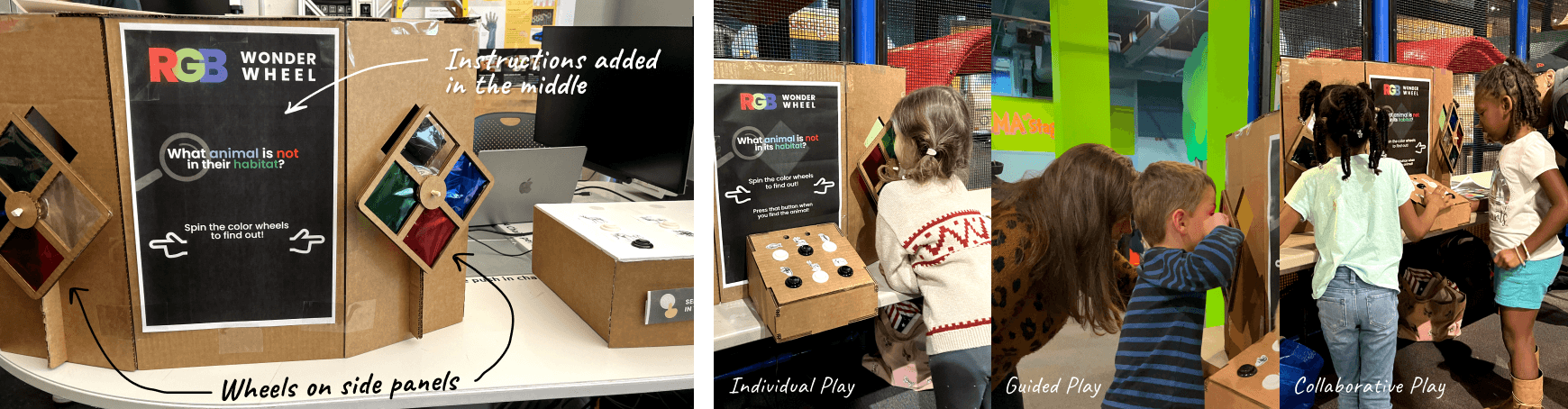
Iteration 03 / Second Museum Test
Iteration 03 / Second Museum Test
Refining for intuitive discovery
Refining for intuitive discovery
The third iteration brought back the two-wheel structure with simplified instructions and an integrated button box which successfully enabled shared exploration. Children could now play alongside each other while viewing through different filters.
The third iteration brought back the two-wheel structure with simplified instructions and an integrated button box which successfully enabled shared exploration. Children could now play alongside each other while viewing through different filters.


Key Findings
Key Findings
Button Distraction: Some children pressed buttons before exploring the filters
Button Distraction: Some children pressed buttons before exploring the filters
Animal Confusion: Similar-looking animals created ambiguity in gameplay
Animal Confusion: Similar-looking animals created ambiguity in gameplay
Increased Engagement: Children stayed longer and played multiple rounds
Increased Engagement: Children stayed longer and played multiple rounds
Instructions still overlooked: Poster remained cluttered and ignored
Instructions still overlooked: Poster remained cluttered and ignored
->
->
What we changed
What we changed
Added directional arrows and visual cues to guide wheel spinning
Added directional arrows and visual cues to guide wheel spinning
Removed visually similar animals, limiting to one animal per habitat
Removed visually similar animals, limiting to one animal per habitat
Added audio feedback for correct/incorrect answers
Added audio feedback for correct/incorrect answers
Simplified and enlarged informational poster and decorated box exterior
Simplified and enlarged informational poster and decorated box exterior
Final Design
Final Design
A colorful discovery machine
A colorful discovery machine
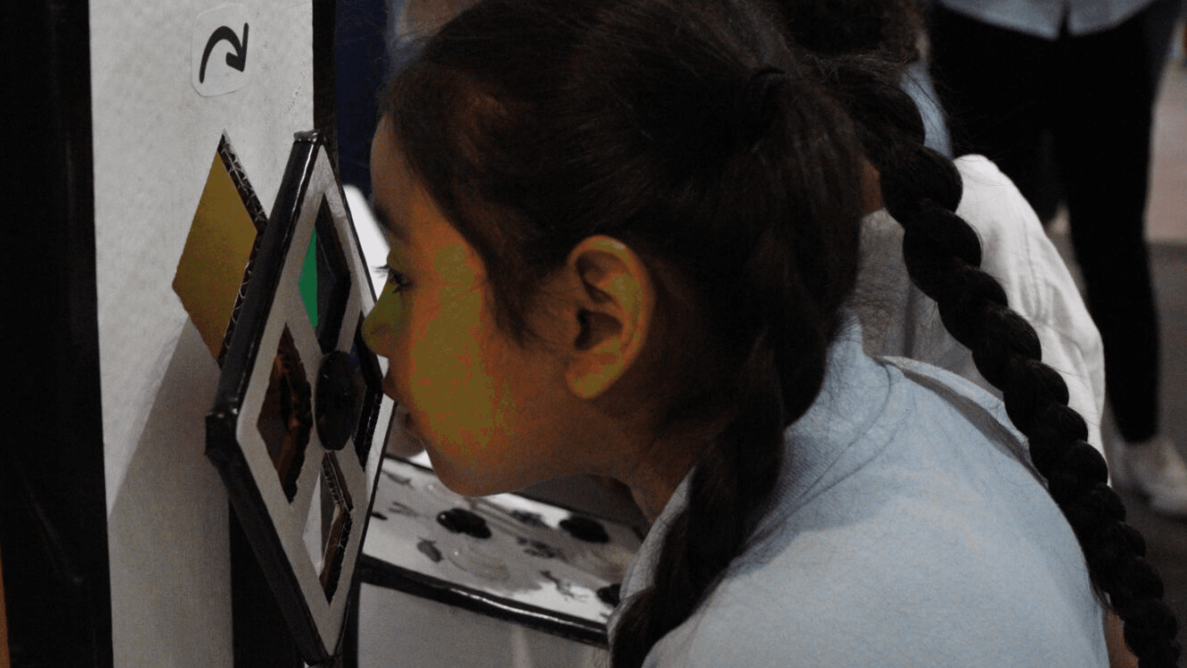
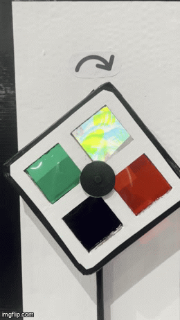
The final RGB Wonder Wheel featured a black and white decorated viewing box with colorful RGB diamond accents, dual filter wheels on side panels, animated animal habitats visible through viewing windows, and an integrated button box with visual and audio feedback.
The final RGB Wonder Wheel featured a black and white decorated viewing box with colorful RGB diamond accents, dual filter wheels on side panels, animated animal habitats visible through viewing windows, and an integrated button box with visual and audio feedback.

How it works
How it works
01
01
Children peer through diamond windows and spin color wheels to reveal habitat layers.
Children peer through diamond windows and spin color wheels to reveal habitat layers.
02
02
Each scene shows three animals, two belong, one doesn’t. Children identify which animal is in the wrong place.
Each scene shows three animals, two belong, one doesn’t. Children identify which animal is in the wrong place.
03
03
They press the corresponding button to check their answer.
They press the corresponding button to check their answer.
04
04
Lights (green = correct, red = wrong) & sounds cues provide immediate feedback, prompting replay or progression.
Lights (green = correct, red = wrong) & sounds cues provide immediate feedback, prompting replay or progression.


Results & Impact
Results & Impact
Measuring success through observation
Measuring success through observation
100+
100+
Kids engaged during testing
Kids engaged during testing
5-8mins
5-8mins
Av. engagement time/ child
Av. engagement time/ child
85%
85%
Understood with minimal instruction
Understood with minimal instruction
High
High
Return rate
Kids revisited
Return rate
Kids revisited
What Worked
What Worked
✔
✔
Visual Excitement: Decorated box successfully drew children's attention from across the museum floor
Visual Excitement: Decorated box successfully drew children's attention from across the museum floor
✔
✔
Sustained Engagement: Kids verbally expressed excitement, played multiple rounds, returning later
Sustained Engagement: Kids verbally expressed excitement, played multiple rounds, returning later
✔
✔
Collaborative Play: Dual wheels enabled children to share discoveries and learn together
Collaborative Play: Dual wheels enabled children to share discoveries and learn together
✔
✔
Intuitive Interaction: After 1-2 rounds, most children understood the gameplay without adult intervention
Intuitive Interaction: After 1-2 rounds, most children understood the gameplay without adult intervention
✔
✔
Accessibility Wins: High-contrast filters worked for tier 1 colorblind visitors
Accessibility Wins: High-contrast filters worked for tier 1 colorblind visitors

Reflection and Learnings
Reflection and Learnings
What this project taught me
What this project taught me
01
01
Scaffold, don't script
Scaffold, don't script
Children need structure to grasp the concept, but too much instruction kills curiosity. We provided visual cues and immediate feedback, then stepped back.
Children need structure to grasp the concept, but too much instruction kills curiosity. We provided visual cues and immediate feedback, then stepped back.
02
02
Design for diversity
Design for diversity
Kids interact unpredictably. Some spun wheels without looking. Others pressed buttons rhythmically. Different ages, abilities, personalities, from shy observers to energetic explorers.
Kids interact unpredictably. Some spun wheels without looking. Others pressed buttons rhythmically. Different ages, abilities, personalities, from shy observers to energetic explorers.
03
03
Test where it lives
Test where it lives
Internal testing found mechanical issues. Testing revealed behavior, kids ignored instructions but followed peers. Breakthroughs came from observation, not conference rooms.
Internal testing found mechanical issues. Testing revealed behavior, kids ignored instructions but followed peers. Breakthroughs came from observation, not conference rooms.
Next Steps
Next Steps
If I had more time
If I had more time
Enhance Audio Feedback: Add louder, more distinct sounds—exciting for success, playful for mistakes, since museum environments are noisy
Enhance Audio Feedback: Add louder, more distinct sounds—exciting for success, playful for mistakes, since museum environments are noisy
Visual Success State: Animate the misplaced animal moving to its correct habitat when children make the right match, creating a satisfying conclusion
Visual Success State: Animate the misplaced animal moving to its correct habitat when children make the right match, creating a satisfying conclusion
Difficulty Levels: Create versions for different age groups, with simpler images for 3-5 year olds and more complex challenges for older children
Difficulty Levels: Create versions for different age groups, with simpler images for 3-5 year olds and more complex challenges for older children
Non-textual instructions: Replace words with pictograms or a looping video demonstration showing how to play
Non-textual instructions: Replace words with pictograms or a looping video demonstration showing how to play